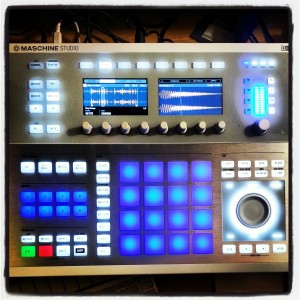
Maschine 2.0 and The Maschine Studio
A short preview and initial thoughts
October first 2013 Native Instruments dropped a bomb on the
heads of the beat creation world.
With the first announcement video, a very slick video HERE
that got the forums and social media drooling for more.
What was this? A new maschine hardware unit, and a rewritten
software engine to the beloved Maschine software.
The first thing that is instantly noticeable about the new
hardware is the luscious new screens. Hi-res screens that
look similar to smart phone screens with gorgeous graphical
displays allowing us to now see everything from the arranger,
to the sample editing, to mapping etc.
These screens providea significant improvement over the previous
MK2 hardware screens. Now sample editing is gorgeous with beautiful
looking waveform displays and zooming that is highly detailed.
No desire to look up to your monitor at all.
Play heads scroll quickly across the screen with no trails or signs
of low quality refresh rates. I noticed no color bleeding or other
issues common to low quality screens.


